Ven Trip Planner
UI & UX Design for a Trip Planning App
I led the UX research and product design for Ven, a trip-planning app exploring how to balance structure with flexibility for travellers. This self-initiated project focused on end-to-end discovery - user research, synthesis, and turning insights into a working prototype in collaboration with a developer.
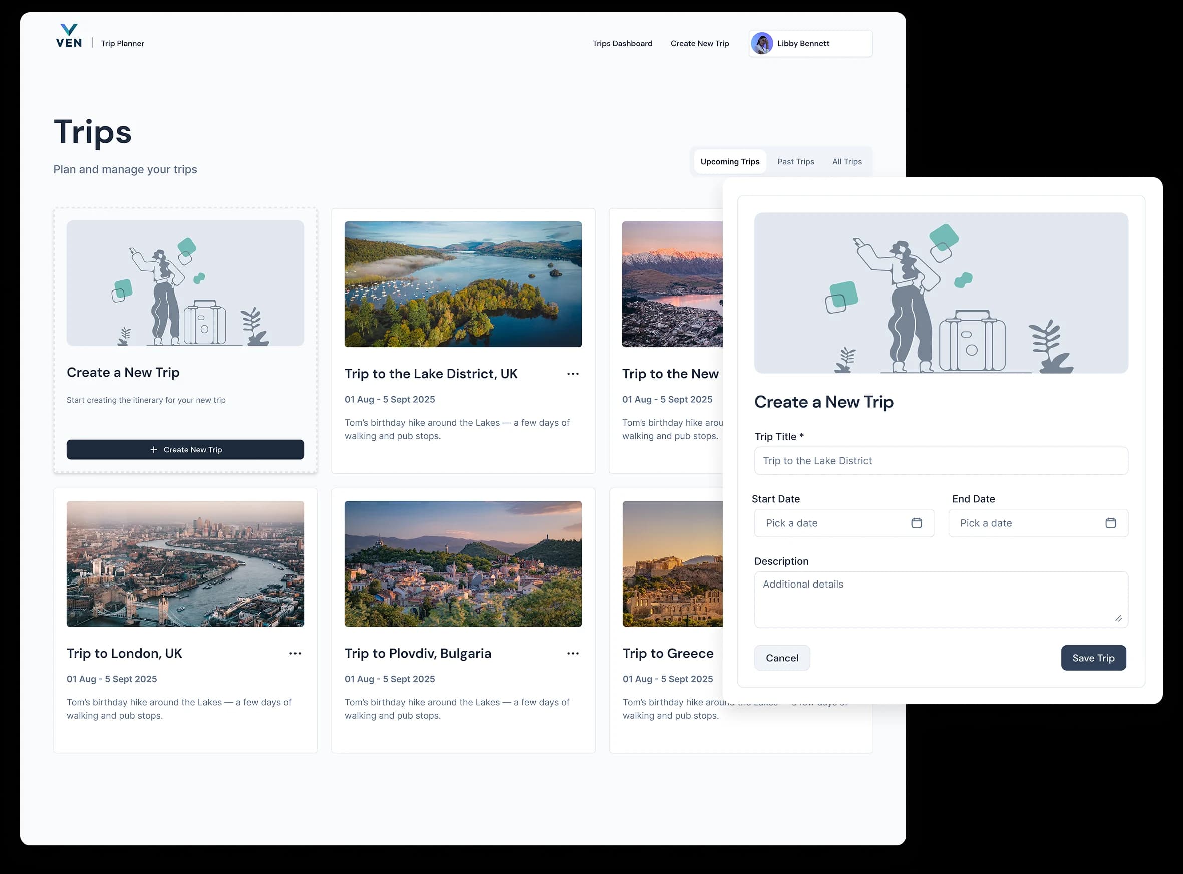
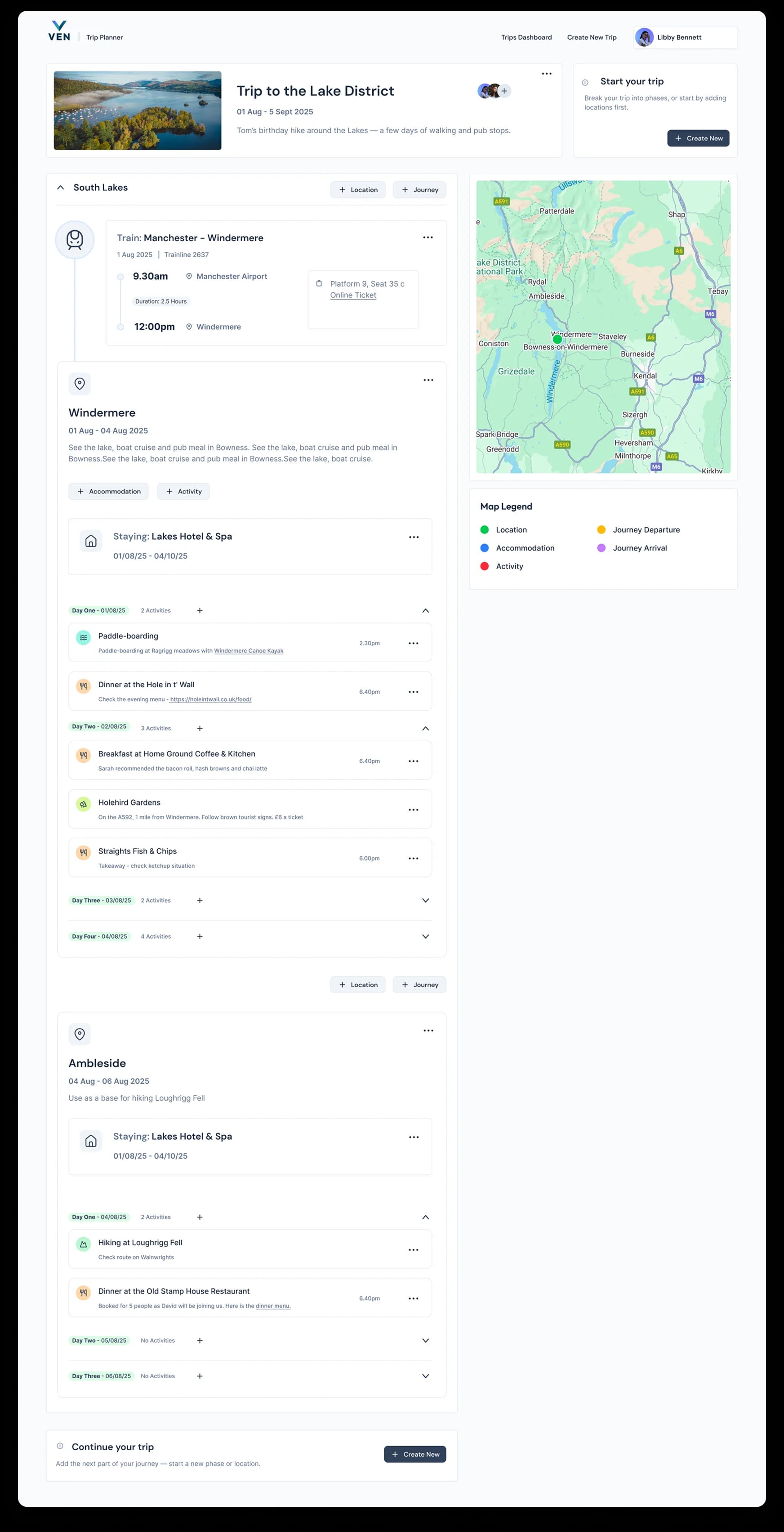
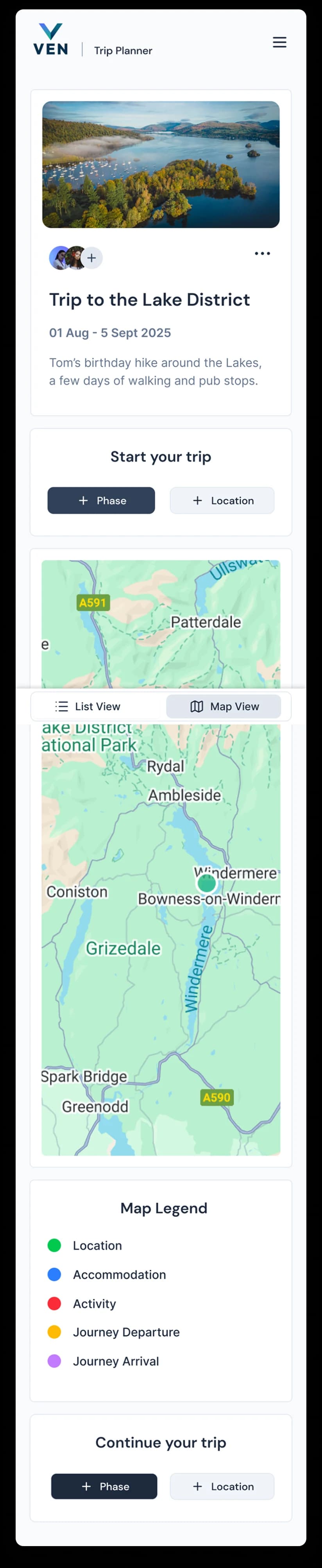
Insights from user interviews directly shaped key features such as dual list and map views, interactive itinerary links, rich note-taking, and trip-mate collaboration, giving travellers clarity and control throughout their journey.

User Research &
Key Insights
Understanding how travellers plan, organise, and adapt trips over time
To synthesise research findings, I grouped interview insights, survey responses, and observations into themes, identifying recurring behaviours, pain points, and opportunities. This process helped move from raw research into prioritised insights that could inform product structure and feature decisions.
Tools & Current Planning Habits
Insight:Users already rely on flexible, multi-purpose tools like Wanderlog and Notion that allow them to centralise trip planning, visualise timelines, and collaborate. They gravitate toward apps that balance structure with freedom.
[Observation]
Users rely on tools like Wanderlog, Notion, Plan & Go, and Tripsy to centralise planning, use maps and timelines, import reservations, track expenses, and share trips.
Libby
[Quote]
“Databases with calendar/timeline views … easily shareable with travel partners” (Notion user).
Libby
Frustrations & Pain Points
Insight:Reliability issues, like app crashes, missing basic features (e.g. time zones, export), and poor syncing, break user trust. Friction around multi-leg transport planning adds cognitive load and limits adoption.
[Pain Point]
App crashes and freezes are common - especially when adding links or saving steps.
Libby
[Pain Point]
Missing features like time zone support, export/PDF options, and incomplete reservation syncing.
Libby
[Pain Point]
Complex transport planning across multiple regions is a major source of friction.
Libby
Summary Opportunities
Insight:Users want a system that balances structure and flexibility, one that supports both meticulous planners and spontaneous travellers. To meet expectations, the experience must feel robust, intuitive, and adaptable from day one.
[Insight]
Users expect frictionless control over the itinerary - reordering, annotating, sharing, and viewing routes.
Libby
[Design Implication]
Build for both high-structure planners and freeform travelers - toggle between modes.
Libby
[Design Implication]
Include offline access, export options, and drag-and-drop interaction patterns.
Libby
Customisation & Control
Insight:Users want a clear, structured itinerary that includes lodging, transport, and key activities. Visual formats like maps and timelines help them understand their trip at a glance. Flexibility is valued for small groups; structure is critical for larger or more complex trips.
[Quote]
“You can rearrange stops … map view saves me so much time.”
Libby
[Pain Point]
“Unable to add times … times aren't shown” -users expect this baseline functionality.
Libby
[Feature Request]
Drag-and-drop itinerary reordering in map and list views is essential.
Libby
[Feature Request]
Ability to add rich notes per item - confirmation codes, reminders, context.
Libby
[Feature Request]
Collaboration support - shared trips, editable by others, budget/expense splits.
Libby
[Feature Request]
Time zone clarity and editable time fields (especially when syncing from other apps like TripIt).
Libby
Must-See Itinerary Info
Insight:Users want a clear, structured itinerary that includes lodging, transport, and key activities. Visual formats like maps and timelines help them understand their trip at a glance. Flexibility is valued for small groups; structure is critical for larger or more complex trips.
[Quote]
“I always like to have a rough itinerary with where I'm staying and my first few transport/accommodation details.”
Libby
[Quote]
“Big groups need tighter itineraries, small groups just need a loose guide.”
Libby
[Insight]
Core info users expect: lodging, transport, key activities all shown clearly in map or timeline views.
Libby
[Feature Request]
Visual, map-based itinerary views help users understand their trip spatially.
Libby
[Feature Request]
Colour-coded categories for pins (e.g. food, sightseeing, transport).
Libby
User Flow: Creating & Editing Trips
Translating Research Insights Into Practical Design
This flow highlights key actions such as adding phases, locations, journeys, activities, and accommodations, as well as editing or deleting trip details. Subtle coloured backgrounds are used to signify container levels, helping to visually organise the hierarchy of steps and show how users move through the process. This made it easier to spot where clarity, flexibility, and control were most important.

Wireframing the trip pages
Defining core flows and structure before visual design
I created these low-fidelity wireframes to plan the main user journeys for Ven, including the trip dashboard, trip creation flow, and trip detail page. This stage helped define the overall structure, navigation, and component layout, making sure the experience felt clear and consistent before moving into high-fidelity design.


First Draft Designs
Initial designs were built using Shadcn components as a foundation, allowing us to move quickly and focus on structure, interactions, and usability. The visual style was intentionally kept neutral at this stage, with the expectation that a more distinctive brand look would be layered on as the product matured.